
Two dark blue tops can create different outfits with the same trousers. One may look smooth across the chest, while another shows a clear knitted surface. You might enjoy the quiet field of the first or the visible structure of the second. Naming that difference helps you choose the arrangement you want and ask better questions about an item before buying it.
Texture is useful to explore through actual garments and the way you intend to wear them. This guide offers a practical vocabulary, four specific combinations and a method for reading product images. It separates visible appearance from properties a photograph cannot establish. You can appreciate a surface while checking its feel, construction and suitability for your day through other information.
Begin with visible structure
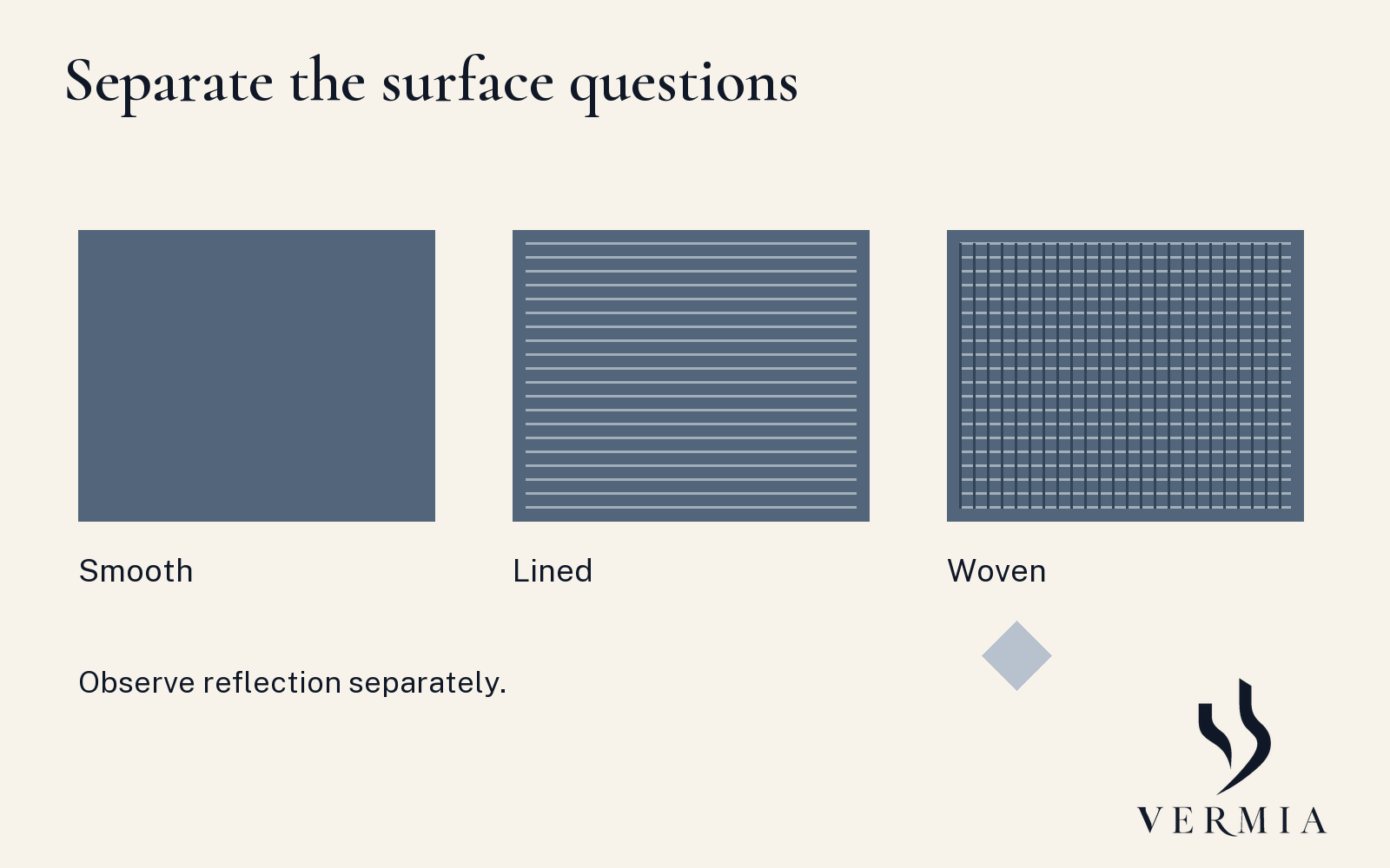
Describe what you can actually see. A surface may appear smooth, finely grainy, visibly woven, ribbed or raised. The CIE defines surface texture through visible structure and the organisation of small constituent parts. That vocabulary helps identify one aspect of appearance. It does not establish everything about a cloth or the experience of wearing the garment made from it.
Use the words as observations, keeping the material identification open until you have reliable information. A photograph that looks woven does not necessarily reveal the exact weave, fibre content or manufacturing method. A useful note might say visible diagonal-looking lines in the product image, with composition still to check. You retain the observation without converting it into an unsupported technical claim.
Look at more than one scale. A close-up can reveal an interesting surface that becomes much quieter in a complete outfit. A prominent rib may remain visible from further away. Check both the detailed and whole-garment views. You are deciding how much visible structure you want in the area the garment occupies, which may differ from the appeal of the enlarged image.
Treat reflection as another feature
Notice how highlights appear as the viewing angle or light changes. A surface can show visible structure and also reflect light strongly in some areas. Smooth-looking and reflective are therefore separate observations to make. The CIE's perceived-gloss definition concerns the brightness associated with regular reflection. It does not turn a highlight in a product image into a measure of quality.
Photography can amplify or soften the impression. A bright directional light, image processing or a particular angle may affect what you see. Where possible, view another image or the actual garment under ordinary conditions. If the appearance matters for a recording, check that setup too. Keep the description tied to the view and check another setting before recording a broader personal preference.
For your own wardrobe, compare a garment near a window and under the room lighting where you usually dress. You do not need to measure gloss. Ask whether you enjoy the visible result in the intended combination. The same garment may be useful in more than one setting, with a different pattern of highlights in each.
Proposal one: a textured knit and a plain lower area
Try a deep blue knit with a visible surface, charcoal trousers and dark shoes you already enjoy. Begin without an outer layer so the knit's contribution is clear. Look at the amount of structure across the upper area and the transition into the trousers. If you have a smoother blue top, compare it while keeping the lower pieces steady.
You may prefer the textured version for its visible detail or the smoother one for another occasion. Record the complete result. If both garments also differ in neckline and fit, include those differences in the note. You can prefer an arrangement without proving that texture alone caused the preference. The practical outcome is a version you would choose to wear again.
Proposal two: a textured layer around a plain centre
Put a plain ivory inner top beneath a navy or brown outer layer whose surface you enjoy. The plain centre and textured frame create another way to distribute interest. Compare the layer open and fastened in the states you would actually use. The visible inner area can change considerably, along with the neckline and the way the pieces sit together.
Then compare a muted blue inner top if you want another colour relationship. Keep the textured outer layer as the valued feature. You are adjusting its surroundings while retaining the piece you enjoy. Check room and movement with each inner garment, since colour compatibility cannot settle whether the layers fit comfortably together. Save the version with its actual wearing mode.
Proposal three: a quieter top with textured trousers
Surface interest can sit in the lower part of an outfit. Try visibly textured charcoal trousers with a smoother pale blue shirt or an ivory knit whose structure is relatively quiet in the complete view. The exact garments determine the relationship. This proposal changes the location of the visible interest, without requiring every other surface to be perfectly plain.
Check the lower area with the intended shoes and outer layer. The trouser's width, hem and colour depth also contribute to what you see. If you enjoy the surface but want another outline, describe both preferences separately. A future candidate can then be assessed for the shape and surface you want, alongside its practical comfort and use.
Proposal four: a small reflective detail
You may enjoy a reflective surface in a limited area, such as a particular tie or accessory used with quieter clothes. Compare its visible amount in the complete outfit and the relevant light. A small detail and a large upper garment offer different arrangements even if both show highlights. Choose the amount that serves the effect you want today.
If you want the detail to become less prominent, compare another surface or reduce the exposed area where the garment allows it. If you want it to remain the focus, retain it while simplifying something nearby. These are styling options to try. They do not assign a social rank, personality or universal level of formality to a particular material.
Keep convention in its own setting
Some classic menswear advice associates smoother surfaces with dressier arrangements and more visible texture with relaxed ones. That is a contextual styling convention. Actual dress requirements, garment type, colour, construction and the complete outfit still matter. A visibly textured garment cannot be placed on a worldwide formality scale simply by looking closely at its surface.
When an event has a specific code, begin with the host's requirements. Use surface as one choice within the appropriate range. For an informal setting, your preferences may leave more room to explore. Record the situation with an outfit you enjoy so that a useful local choice does not quietly become a rule for every future occasion.
Read an online product page with two questions
First ask what the images show. Look for a complete garment view, a surface close-up and, if available, another lighting angle. Describe the structure and reflection you can see. Check whether the photographed styling is responsible for part of the appeal, such as an open layer or a contrasting inner top. Keep the item and its arrangement distinct.
Then ask what information you need to establish use. Read the supplied fibre composition, construction details, measurements and care instructions. Some properties may remain unclear. If softness against the skin matters, ask whether you can assess it through a sample or an appropriate try-on within the seller's conditions. A visual description cannot replace that experience.
Warmth, breathability, durability and weather protection need their own evidence. Avoid inferring them from how substantial, natural or expensive a fabric appears in a photograph. The relevant property can depend on several material and garment features. Use reliable supplied information, your own experience and appropriate specialist guidance when the requirement is important to the purchase.
Write a surface brief you can use
Imagine you want a navy outer layer with enough visible weave to interest you around a plain ivory centre. Your practical brief might add that it must accommodate a particular shirt, feel comfortable at the desk and suit the conditions in which you will use it. The visual preference and the practical requirements are both visible, with neither standing in for the other.
Try an existing piece before looking for another one. Photograph the complete combination privately if it helps you remember the arrangement. Add the setting and one after-wear observation. You might enjoy the surface but want a different inner neckline, or prefer its appearance under another light. Each note makes your next comparison more specific and lets you keep the features that already work.
For an online enquiry, make the missing information specific: “I like the visible surface in the close-up. Can you confirm the composition and care instructions, and whether the full garment image shows the same fabric?” If you need to assess feel, ask about the available sample or try-on conditions. You are separating the appearance that attracts you from the practical information needed for a useful decision.
Sources
- CIE, surface texture, e-ILV 17-24-140. Technical vocabulary for visible structure; not a claim about material performance.
- CIE, specular gloss, perceived, e-ILV 17-22-122. Appearance vocabulary for reflected brightness.
- Simon Crompton, Seven levels of formality, Permanent Style. Practitioner convention used only for the contextual smooth/textured distinction, without adopting a universal ranking.
The four combinations and product-page exercise are original editorial proposals. The supporting artwork is explanatory, with no tested textile samples or copied source images.