
Your wardrobe may already contain the beginnings of a useful palette: charcoal trousers you wear with several tops, a blue shirt you repeatedly choose and an outer layer that connects them. Start with one complete outfit you enjoy. It gives colour planning a real reference, including garment shape, surface and the situations where the clothes actually work for you.
A palette becomes useful through the combinations it supports. This guide shows how to identify recurring colours, give them practical roles and try six distinct directions. It also explains what to do with a colour you love that fits only a few outfits. You can build a small reference without requiring every item you own to combine with every other one.
Start with an actual combination
Choose an outfit you have worn comfortably and would repeat for a defined part of your life. Set out the pieces together, including shoes and any outer layer. Write down the actual colours with enough detail to recognise them: pale muted blue shirt, dark navy jacket and charcoal trousers, for example. Broad names alone can conceal differences that matter when you compare another garment.
Keep available clothes separate from pieces needing care or repair. An item can have a useful colour and still be unavailable for tomorrow's outfit. Similarly, a reference photograph may show something you do not own. Those distinctions keep the palette connected to choices you can actually make. Begin with the combinations already available and make any future possibilities explicit.
Name the situations the first palette should serve. Informal work and evening meals may share some pieces while leaving a formal event to its own preparation. A clear starting scope helps you judge whether an addition fills a recurring need. You can expand the reference later without asking one small group of garments to cover every occasion.
Give colours roles based on use
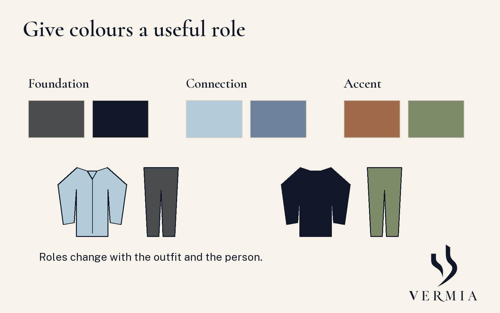
For this exercise, use three roles: foundation, connection and accent. A foundation appears in a garment you repeat across useful combinations. A connecting colour relates options you want to wear together. An accent is a colour you choose to make noticeable in a particular arrangement. These are ordinary planning descriptions that you can change as your wardrobe and preferences develop.
Charcoal trousers might provide a foundation beneath several tops. Blue might connect a pale shirt and a deeper knit used on different days. A rust scarf might supply an accent within a navy arrangement. Another reader could use green as a recurring foundation and ivory as an accent. The role belongs to the person's actual use, with no permanent hierarchy between colours.
Look for evidence in your own clothes. If your olive trousers support several outfits you enjoy, record them as a foundation. If your navy jacket has one specific purpose, keep that purpose visible. A conventional reputation for versatility does not establish that a particular item works with your preferred garments, activities or climate. Test the actual combinations before granting the item a broader role.
Describe depth and strength as well as family
Pale blue, medium blue and deep blue can occupy different positions in an outfit. A vivid green and a subdued green can also create different relationships with the same trousers. Everyday descriptions such as family, relative depth and colour strength help you choose the comparison you want. They simplify technical colour distinctions without claiming that you have measured a fabric's appearance.
Suppose your dark blue shirt feels too close in depth to the navy jacket for the effect you want. Compare a lighter blue shirt while keeping the jacket and trousers steady. If you like the depth but want a quieter coloured centre, compare a more muted version. Those are separate questions, each giving you a specific alternative to inspect.
Perceived colour also depends on the viewing conditions. Check the actual clothes together in a relevant place and, where useful, another setting in which you will wear them. A palette saved on a screen is a reminder of a combination you have considered directly. It cannot establish an exact fabric match or a personal result under every possible light.
Six palette directions to try
Use these as original starting proposals with equivalents you own. Each describes a relationship to compare, with fit, garment type and practical requirements assessed separately.
| Direction | Proposed combination | Useful comparison |
|---|---|---|
| Light centre, dark frame | Pale blue shirt, navy layer, charcoal trousers | Ivory inner top in the same opening |
| Close dark depths | Deep blue top, charcoal trousers, dark navy layer | A lighter centre if you want clearer separation |
| Muted earth colours | Subdued olive top, stone trousers, brown layer | A muted blue top with the same lower pieces |
| Light upper and lower areas | Ivory knit, stone trousers, navy layer | The arrangement with and without the dark frame |
| A warm accent | Navy top, charcoal trousers, rust scarf | The same outfit without the scarf |
| A coloured foundation | Olive trousers, pale blue shirt, navy layer | An ivory shirt with the same trousers |
One direction may serve several outfits, and you may enjoy more than one direction. Keep the garment and state of closure with the note. The size of a visible colour area matters: an open navy layer around an ivory inner top differs from a largely closed navy upper area. Compare the version you intend to wear.
Find the pieces that connect your wardrobe
Return to a familiar pair of trousers and place two or three candidate tops beside it. Try the complete combinations with the relevant shoes. Then add a familiar layer where needed. Notice whether one shirt supplies a colour relationship you enjoy across several arrangements. That actual role can make it a useful reference for the next choice.
You can make a small list of successful combinations without calculating a universal versatility score. Record the pieces, wearing mode and situation. An item used in two outfits you genuinely enjoy may serve a clear purpose even if another item appears in more theoretical pairings. Actual use gives the list meaning; the arithmetic by itself leaves the practical questions open.
If a garment works only with one companion, record that dependency. A distinctive jacket or coloured trouser can still be valuable within a specific arrangement. Keeping it outside the first small rotation may help you use it more clearly. You do not have to force every piece into one interchangeable system or treat a specialised use as a failure.
Keep a colour you love in a useful role
Suppose you enjoy a vivid green but hesitate over a whole upper garment in that colour. Compare a smaller visible area if an appropriate piece is available, or try a more muted version with familiar clothes. You are exploring amount and strength as distinct options. The original green can remain a preference even if another version serves your ordinary week more often.
If you already own the vivid top, begin with the clothes around it. Plain charcoal trousers and a navy layer offer one proposal to try. Check whether you enjoy the top alone and framed by the layer. Keep any successful arrangement with its intended situation. A colour can have a useful place without becoming the centre of every outfit you wear.
Turn a recurring gap into a specific brief
Imagine two tops work well with charcoal trousers, but your favourite outer layer leaves you wanting a lighter centre. Try another light top you own first. If the gap remains, describe the proposed addition through the combinations it would serve: a pale muted blue shirt that fits beneath this layer and works with these trousers. Include the collar and wearing mode you want.
Then assess practical requirements separately. The candidate needs suitable measurements, comfort, care requirements and construction for the intended use. A colour that completes the screen palette does not settle those questions. Check the actual garment and the seller's supplied information. Keep the item as a possibility until it has passed the comparisons important to your decision.
After wearing a new combination, add one useful observation to the palette record. You might prefer the jacket open, another inner colour under office lights or a different shoe beside the trousers. The reference can grow through these small, specific decisions. You retain combinations that already work and make the next addition answer a clearer question.
Keep the record small enough to revisit
Use one page with three headings: combinations I repeat, another option to try and information still needed. Put the actual garments under the first heading. A light shirt you own but have not tried with the jacket belongs under the second. An online candidate whose colour or measurements remain unclear belongs under the third. Those categories separate a working outfit from a possibility.
Revisit the page when a real need appears, such as another working day or a change in season. Start by checking the existing combinations. You can then add one comparison with a clear purpose and keep the result alongside the clothes that made it useful.
Sources
- CIE, perceived colour, e-ILV 17-22-040. Colour vocabulary and dependence on viewing conditions; not a personal palette prescription.
- Simon Crompton, Selecting colour and pattern, Permanent Style. A practitioner reference for navy and grey within classic tailoring. Its complexion exclusions and universal business-colour claims are not adopted.
The colour roles, six directions and shopping-brief exercise are original editorial proposals. No optimal wardrobe size, complexion diagnosis or measured purchase-saving effect is claimed.