
A fine striped shirt and a checked jacket can each be appealing on their own. Put them together and you have a new arrangement to assess. The size of the marks, their spacing, their contrast and the areas you expose all contribute. You can make that decision more manageable by starting with the patterned piece you most enjoy and giving the next comparison a clear purpose.
Begin with actual clothes where possible. A product close-up may make a small pattern appear much more prominent than it does across a complete outfit. This guide gives you a practical vocabulary, four worked proposals and a short exercise for adjusting a combination. The suggestions leave the preferred result open, with no pattern assigned to a particular body shape.
Describe the pattern you actually have
Separate the motif from its other features. Stripe, check and dot describe broad families. A fine closely spaced stripe differs from a broad stripe with a large plain interval. A pale check on a light background differs from a dark check on the same light ground. Naming those differences gives you options to adjust while preserving something you already like.
Look at the pattern from close range and at the distance of a normal outfit view. Notice whether individual marks remain distinct or become a more continuous impression. Neither result is automatically preferable. You may enjoy a quiet repeated surface under a plain jacket, or a clearly visible pattern as the main feature. Keep the intended setting and your preference in the decision.
Use approximate descriptions that you can recognise again: fine navy stripe on pale blue, widely spaced cream lines on green, or small light dots on dark blue. You do not need to measure every motif. If comparing products online, ask for a complete garment view as well as a detail photograph. Keep colour and material uncertainty visible until you see the actual item.
Choose the patterned piece to retain
Set out the shirt, jacket or accessory you most want to wear. Add familiar plain companions as a baseline. For a striped blue shirt, that could be charcoal trousers and a plain navy jacket. You can now see the shirt's contribution before introducing another pattern. The baseline is a comparison tool, not a rule that every outfit must contain only one pattern.
Decide what you enjoy about the starting piece. Perhaps the colour matters more than the stripe, or the larger check is the feature you want to keep visible. That distinction helps when the combined result feels more active than you want. You can retain the valued feature and compare a quieter companion, a different scale or a smaller exposed area.
Proposal one: a fine stripe and a larger check
Try a fine navy stripe on pale blue beneath a larger, relatively quiet blue-and-brown checked jacket, with plain charcoal trousers. The patterns differ in scale, while some colour relationships may connect them. This is an original styling proposal to inspect with actual garments. Different scale gives you an alternative to compare; it does not guarantee that every pair of patterns will work together.
Check the jacket open as intended, then consider the actual visible shirt area. If you enjoy the check but want a quieter centre, compare a plain pale blue shirt. If you enjoy the stripe and want more separation around it, compare a plain jacket. Both changes preserve a chosen feature and answer a specific question about this outfit.
Keep the trousers and shoes steady during the first comparison where possible. Changing several pieces at once can make it harder to describe the difference you enjoyed. If several changes are necessary, record the complete preferred arrangement without claiming that one property caused the result. A practical wardrobe comparison can be useful while remaining imperfectly controlled.
Proposal two: a checked shirt within a plain frame
Use a checked shirt with plain navy trousers and a plain outer layer. Compare wearing the shirt alone with wearing the outer layer open. The pattern is identical, but the exposed area changes. You may enjoy a larger patterned field for a relaxed afternoon and a smaller centre for another occasion. Record the situation alongside the preferred wearing mode.
Look at the nearest colour around the face too. A scarf or higher inner neckline can cover part of the shirt's pattern. That may be useful if you want to retain the shirt and adjust its visible amount. Include comfort and temperature in the decision. The option should suit the actual day as well as the view in the mirror.
Proposal three: a small repeated motif and a striped shirt
If a tie suits the occasion and your preferences, compare a small repeated motif on a dark tie with the fine striped shirt you already enjoy. Keep the jacket plain at first. Notice the relative prominence of the two patterns in the finished arrangement. The tie's smaller visible area offers a different comparison from adding a second patterned jacket.
If you want the tie to be clearer, try a plain shirt while retaining the tie and outer layer. If you want the shirt's stripe to remain the main feature, compare a quieter tie or another permitted wearing mode. The useful question is which detail you want to notice, not whether the outfit has passed a fixed limit on pattern count.
For a setting with a stated dress code, establish its requirements before using this proposal. The presence of a tie does not by itself make an outfit suitable for every formal event. The garment types, complete arrangement and relevant convention remain important. A pattern exercise helps with one part of that larger decision.
Proposal four: two patterns with quieter contrast
Compare a subdued small check with a wider-spaced stripe whose marks sit relatively close to its background in depth. Keep the remaining garments plain for the first view. You are exploring whether lower contrast gives you the amount of activity you enjoy when two patterns are present. Their actual colours, spacing and visible areas will determine the particular arrangement.
Then try one of the patterns with stronger contrast if you have a suitable alternative. Record which version you enjoy and where you would wear it. You may prefer the quieter pair for one situation and a stronger patterned feature for another. Multiple preferences can coexist in the same wardrobe without needing a single rule that covers every garment.
What research can and cannot settle
Stripe folklore often makes broad claims about body appearance. In a 2013 controlled study, Ashida and colleagues analysed judgments from 30 undergraduate observers viewing static computer-generated figures based on a female template. The results depended on conditions and observer differences. This task does not establish an ideal stripe for each reader's body or show that a pattern changes physical fitness. Its relevance is a reason to examine the limits of broad direction rules.
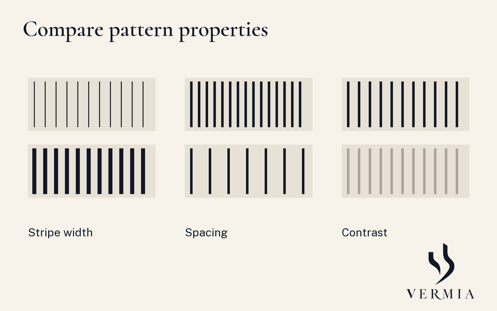
The practical implication here is limited: keep pattern decisions attached to the actual garment, arrangement and preference being considered. There is no need to organise this exercise around correcting body size. The supporting image illustrates pattern properties only. It is not a research graph, a reproduction of the studies' figures or a prediction of how other people will judge you.
Check the camera when relevant
Fine repeated marks can interact with a camera's sampling and create moiré or false colour. Nikon explains the image-making issue in its technical note. If the outfit is for an important video call or recording, make a short test using the intended device, distance and lighting. Inspect the actual output as well as your direct view of the clothes.
If you see an unwanted effect, compare another pattern or a plainer garment and test again. Keep the result attached to that setup. A successful view on one camera does not guarantee the same output on all devices. You are answering a particular practical question, which can sit alongside your personal preference for how the garment looks in person.
Finish with a usable pattern note
Write three lines: the patterned piece you retained, the companion you preferred and the wearing mode or situation. For example: fine navy stripe; plain navy jacket with charcoal trousers; jacket open for the informal meeting. If you compared a larger check and decided to keep it for another outfit, add that as a separate option.
The note can guide a future purchase. Ask whether a new patterned piece adds a specific option to combinations you already use. Try it with the actual clothes and repeat the same comparisons. You keep the detail you enjoy, understand the difference you are exploring and leave yourself more than one possible ending.
Keep a second option when it serves another purpose. A larger check that feels prominent in one jacket opening may be exactly the detail you enjoy with a plain shirt. Record that complete version separately. Your reference can contain several pattern relationships, each connected to particular clothes and a situation, with no requirement to choose one formula for the whole wardrobe.
Sources
- Ashida, Kuraguchi and Miyoshi, 2013 follow-up. Controlled static-figure task with condition and observer limits; its title's fitness language is not a physical-health inference.
- Nikon, Moiré & False Colour, pp. 1–2. Image-sampling explanation. The proposed camera check is an editorial application.
The four outfit proposals and comparison exercise are original styling guidance. No source images are copied.