
Take a patterned shirt you like and place it beside the trousers you usually wear. Something about the combination may already feel right: a colour you enjoy, the spacing of the pattern or a fabric with a visible weave. Keep that feature in view. It gives the next decision a purpose and helps you make an outfit that still feels personal.
Colour, pattern and texture change one another's appearance when brought together. You can explore those relationships through a few concrete comparisons. The suggestions below are starting points to try with actual clothes. They offer ways to notice what changes while leaving the preferred result with you, and they avoid assigning an ideal pattern or surface to a particular body shape.
Name the feature you want to keep
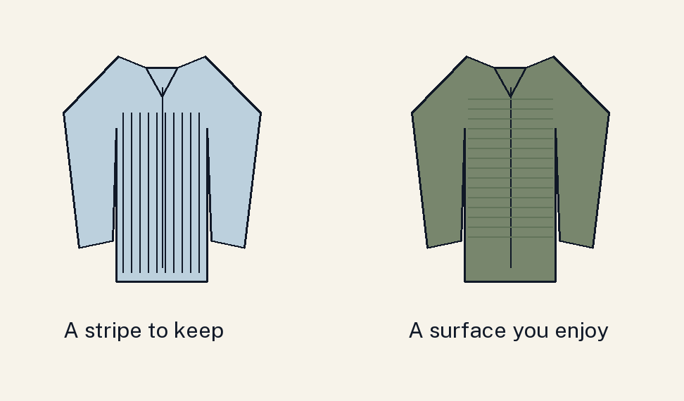
Suppose your starting piece is a pale blue shirt with fine navy stripes. You may like its light background, the repeated blue lines or the crisp collar. Choose the feature that matters most today. Then compare it with charcoal trousers and a navy outer layer. If you want the stripes visible, check how much shirt remains exposed when the layer is open or fastened.
For another example, begin with a muted green knit whose surface you enjoy. Try it with dark indigo jeans and with charcoal trousers. The colour remains part of both arrangements, while the lower surface and shape change. You may prefer different versions for different situations. Recording the complete combination is more useful than deciding that textured clothes always need a particular companion.
Describe the aim in one sentence: I want to keep this shirt's stripe visible within a dark frame. Or: I want a close dark palette with a clear difference in surface. These aims make the comparison manageable. They also help you preserve a valued garment while considering a change elsewhere. Start with one change and keep the other pieces steady.
Separate pattern size, spacing and contrast
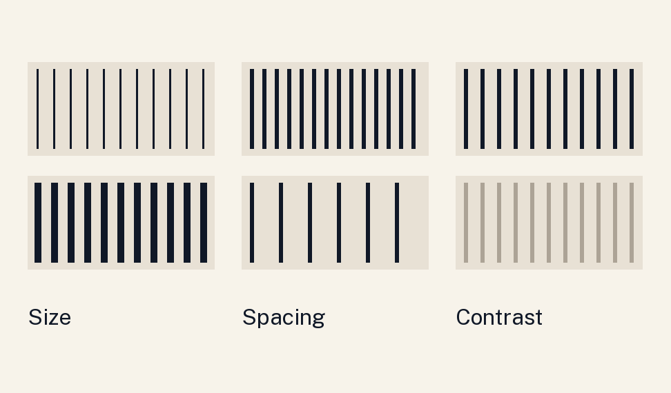
A pattern has several features. Its motif may be a stripe, check or repeating shape. The marks can be small or large, close together or widely spaced, and similar to or strongly different from the background in colour and depth. Two shirts described as striped can therefore create very different impressions. Look at the actual pattern in the area you intend to show.
Imagine two navy-and-ivory stripes, one fine and closely spaced, the other broad. Compare them with the same trousers. Then imagine keeping the broad spacing but using two colours closer in depth. You have changed another feature. This distinction helps you understand a preference: perhaps you enjoy a larger pattern when its contrast is quieter, or a stronger contrast in a smaller visible area.
If you want a quieter result, try a pattern whose marks and background are closer in depth, a smaller exposed area, or a plain surrounding garment. These are options, not a ranking of taste. If you want the pattern to remain prominent, keep the larger area and simplify something else. Let the intended effect guide the choice you test.
Compare one pattern before adding another
Start with your striped shirt, plain charcoal trousers and a plain navy jacket. This makes it easier to see the shirt's contribution. If you then want another pattern, try it while retaining the other pieces. A small repeated mark in a tie and a broad stripe in a shirt offer a different relationship from two similarly sized, strongly contrasting patterns close together.
Varying scale or contrast can give you alternatives to compare. There is no need to turn the suggestion into a rule that different scales always work. Actual colours, spacing and visible area matter. A tie occupies a different area from a jacket; a scarf may cover much of the shirt. Look at the finished arrangement from the distance at which you normally view it.
Keep the question specific: do I enjoy both patterns clearly visible, or would I prefer one to draw more attention? You can alter the tie, the outer layer or the shirt opening to explore that preference. Clothing does not need to pass a universal coordination formula. A useful comparison tells you which version you would choose for this occasion and why.
Use the frame to change the visible area
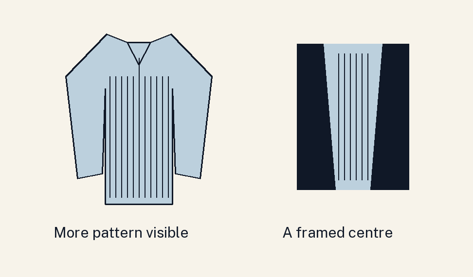
An outer layer can make a patterned shirt a narrow centre within a largely plain outfit. Wearing the same shirt without the layer exposes a larger area. Compare both before deciding whether the pattern feels too prominent for your purpose. You may enjoy the framed version for one setting and the larger area for another. The shirt remains the same.
Try a second arrangement with a patterned overshirt over a plain inner top. Open and closed versions distribute the patterned area differently. Check comfort, temperature and the garment's intended wearing mode alongside appearance. A styling option is useful when you can move and spend the day in it, as well as enjoy the view in a mirror.
This is also a way to keep a colour or pattern you enjoy in a smaller amount. An exposed collar, inner neckline or scarf may provide enough detail for the outfit you want today. The next day you might choose a larger area. Save the actual state of closure with a reference photograph so you can reproduce the version you liked.
Describe texture through what you can see
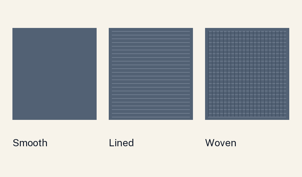
Notice whether a surface looks smooth, finely grainy, visibly woven, ribbed or raised. Also observe how it reflects light. Two dark garments may have similar colour depth while showing different structures or highlights. The CIE defines surface texture through visible structure. Seeing that structure does not tell you everything about touch, warmth, durability or the quality of a garment.
For a practical comparison, keep charcoal trousers and try a smooth deep blue shirt, then a deep blue knit with a visible surface. The colours may be close while the upper surface changes. Try a jacket with each if that is how you intend to dress. Decide whether you enjoy a quieter surface relationship or a more noticeable difference between the pieces.
Some menswear traditions associate smooth surfaces with dressier arrangements and more obvious texture with relaxed ones. Treat that as a convention within a setting. The actual dress requirement, garment design and complete combination still matter. A rough-looking surface cannot tell you the appropriate level of formality by itself, and a photograph cannot establish how comfortable a fabric will feel against your skin.
Check the camera if the outfit will appear on screen
Fine repeating patterns can interact with a camera's sampling and produce moiré or false colour. Nikon explains this as an image-making issue. For an important video call or recording, view a short test using the device, distance and lighting you expect to use. Look at the actual output before deciding whether the pattern works for that particular setup.
If you see an unwanted effect, compare a plainer garment or a different pattern, and test again. A good result on one camera does not guarantee the same result on every device. You are checking a practical use case. The test can sit alongside your direct view of the garment, with each answering a different question about the outfit.
Finish by writing one sentence about the version you kept: fine blue stripe, charcoal trousers, plain navy jacket open, suitable on the meeting camera. Add the feature you enjoyed and anything you would change next time. You now have a complete combination and a reason for it. That record makes the next colour, pattern or texture decision more specific.
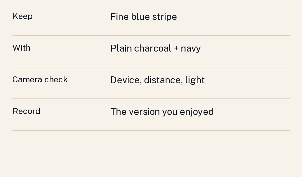
A comparison with three possible endings
Return to the pale blue shirt with fine navy stripes. In the first version, wear it with charcoal trousers and a plain navy jacket. You keep the stripe as a visible centre. In the second, retain the trousers and shirt while trying a visibly textured outer layer. Ask whether you enjoy that extra surface alongside the repeated lines. The change has a defined purpose and a clear point of comparison.
In the third version, keep the textured layer and charcoal trousers but try a plain pale blue shirt. You have removed the stripe while retaining a similar broad colour arrangement. Perhaps the surface of the jacket becomes the feature you most enjoy. Perhaps you prefer the original striped centre. Either result tells you something about these particular clothes, with their actual colours, construction and visible areas.
Use the same approach if two patterns feel more active together than you want. Keep the pattern you value most, then compare a plain companion, another pattern with quieter contrast, or a smaller exposed area. You can make a deliberate choice among alternatives without treating one result as a verdict on your taste or body.
Keep a brief note of the versions you would repeat and the situations you have in mind. A reference can include more than one successful ending. The useful lesson is the relationship you noticed, such as enjoying a fine stripe within a plain frame, and the concrete combination that lets you use it again.
Sources
- CIE, surface texture, e-ILV 17-24-140. Vocabulary for visible surface structure, with no inference about comfort or material performance.
- Nikon, Moiré & False Colour, pp. 1–2. Image-sampling explanation. The clothing test is an original application; historical camera-buying advice is not reproduced.
The outfit combinations and comparisons are original styling proposals. No ideal pattern scale, stripe direction or texture is prescribed for a body type.