
Choose two shirts from your wardrobe and put on the trousers you want to wear with them. You have the beginnings of a useful colour comparison. One shirt may create a lighter area around your face, while the other makes a quieter transition into a dark jacket. Both results can be useful. Begin by deciding which result interests you for this particular outfit.
A colour name gives you only part of the information. Green can describe a pale muted shirt, a vivid polo or a deep forest knit. If you enjoy one and hesitate over another, look for the difference you can actually change. The following approach uses visible features and your own preferences to help you find a combination worth keeping.
Give the comparison a purpose
Write a simple sentence before trying anything: I want a shirt that creates a light centre under this navy jacket. Or: I want a coloured top that works with these charcoal trousers. That purpose helps you decide what to compare. You can revisit it for another occasion without needing to declare a permanent best colour for your entire wardrobe.
Keep the garments reasonably similar in shape while exploring colour. A soft open polo and a stiff buttoned collar change more than the coloured surface. If those are the pieces you own, compare them anyway, but describe the complete result. You may discover that you prefer the opening, the fabric or the combination of features. That is still useful information.
Use specific language for what you see. Instead of saying that a colour makes you look wrong, try: the shirt is more vivid than I want, the opening is lighter than the rest of the outfit, or I enjoy the boundary at the neck. Each observation suggests a practical next comparison and lets you retain the features you already appreciate.
Change one colour property where possible
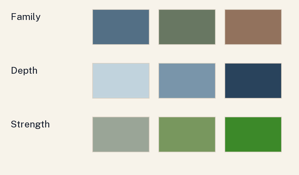
For everyday purposes, distinguish family, relative depth and colour strength. Family means the broad colour you recognise, such as blue or green. Depth describes a lighter or darker appearance. Strength describes how vivid or muted a colour appears. These are simplified wardrobe descriptions; they are not instrument measurements of the fabric or substitutes for the CIE's technical definitions.
Suppose a vivid green shirt feels more prominent than you want. Try a muted green of roughly similar depth before rejecting the whole family. If a deep green merges into your navy jacket more than you enjoy, compare a lighter green. If you like the depth but want another family, compare a similarly muted blue. Each change answers a different question.
Perfectly controlled pairs are uncommon in a wardrobe. One shirt may be both lighter and more muted than another. You can still record a preference for the whole result. Just leave the cause open: I enjoy this softer blue with the jacket, and I have not yet separated the effects of its depth and colour strength. That note keeps the conclusion proportionate.
Start with three concrete combinations
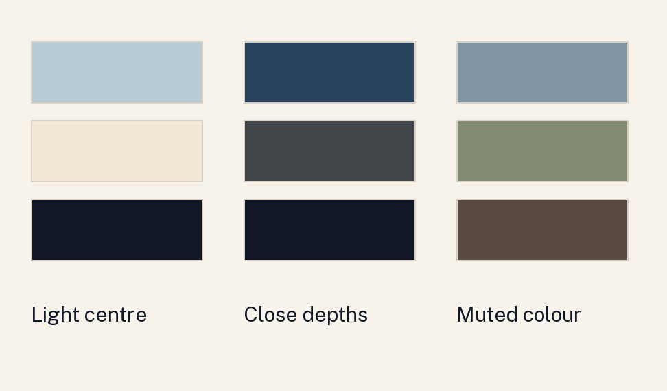
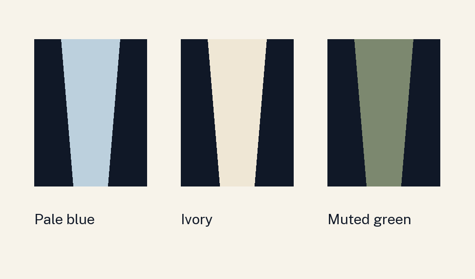
For a light centre beneath a dark outer layer, compare pale blue and soft ivory with the same navy jacket and charcoal trousers. Pale blue adds a recognisable colour family; ivory offers another light area. View the collar in the opening you actually wear. These are styling proposals to try, with the jacket and trousers held steady as much as possible.
For a closer arrangement in depth, compare a deep blue shirt and a charcoal shirt with dark navy trousers. Notice how distinctly you want the top and trousers to separate. The result also depends on the actual fabrics and lighting. You might enjoy the deep blue during the day and prefer a lighter shirt when a more visible centre is useful.
For a muted coloured centre, compare dusty blue and subdued olive with charcoal trousers and a dark brown outer layer. You can begin with either family you already like. If one feels stronger than you want, try a less vivid version before changing everything. None of these combinations assigns a palette to a skin category. The purpose is a manageable, personal comparison.
Include the complete area around your face
Look at skin, hair, eyes and facial hair in the view you will actually use. New Mexico State University's consumer-colour guidance includes these features and comparisons near the face. We use that starting point here while keeping your preferences central. There is no need to rank complexions, attach health judgments to skin appearance or exclude whole colour families from consideration.
If you have grey hair, for example, compare a pale shirt with a medium-depth shirt under the same jacket. Ask whether you enjoy the lighter upper area or prefer a more distinct boundary at the neck. If you have dark facial hair, the visible relationship can differ from a clean-shaven reference photograph. Compare your current appearance with the actual garment in a familiar outfit today.
Eye colour can be a source of inspiration for a blue, green or brown family you want to explore. It does not settle which depth, strength or garment you will enjoy. Similarly, descriptions such as olive-looking or golden can help you explain what you see without becoming a diagnosis. If those labels are unclear, proceed with the garments and the specific comparison.
Adjust the amount of colour you see
An open jacket frames the inner garment. Closing it changes the visible area. A scarf can cover much of a shirt's neckline, and a higher knit can replace the collar as the colour nearest the face. Compare the state you intend to wear. A photograph of a jacket open may give you little information about the same combination fastened high.
This offers options when you love an outer layer and want another colour immediately around your face. Keep a dark brown coat and charcoal trousers, then compare cream, muted blue and deep green inner layers. The coat stays part of the outfit. You are exploring the centre colour and its visible area, while preserving the piece you already enjoy wearing.
You can use the same idea with a colour you prefer in smaller amounts. An inner neckline or scarf may provide the amount you want when a whole shirt feels too prominent. Check how the fabric sits and whether it suits the temperature and purpose of the day. The useful option is the arrangement you would actually choose to wear.
Make the viewing conditions worth recording
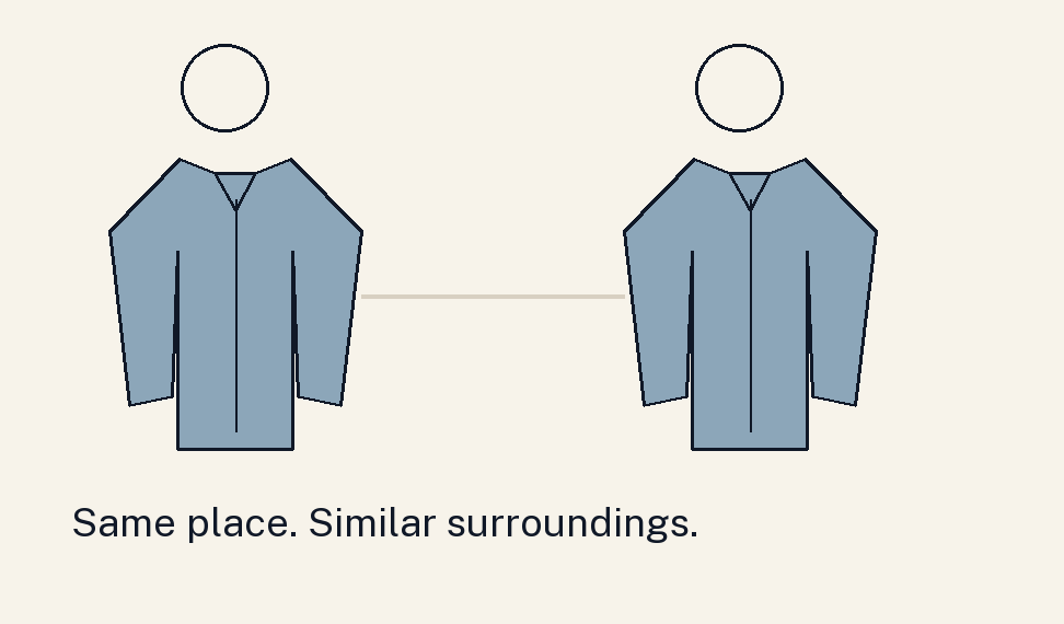
Compare the options in the same place and within a short period, with similar surroundings. Perceived colour depends on viewing conditions as well as the object. A bright shop light, a shaded room and a phone image can give you different impressions. Choose a comfortable everyday view, then check the combination in another setting where you expect to wear it.
If you use photographs, keep the camera position and lighting reasonably steady. Phones can change exposure and white balance between frames. Treat the image as a reminder of an arrangement you have also seen directly. A camera preference can be useful for video calls, but it does not establish a universal colour result for your face in every environment.
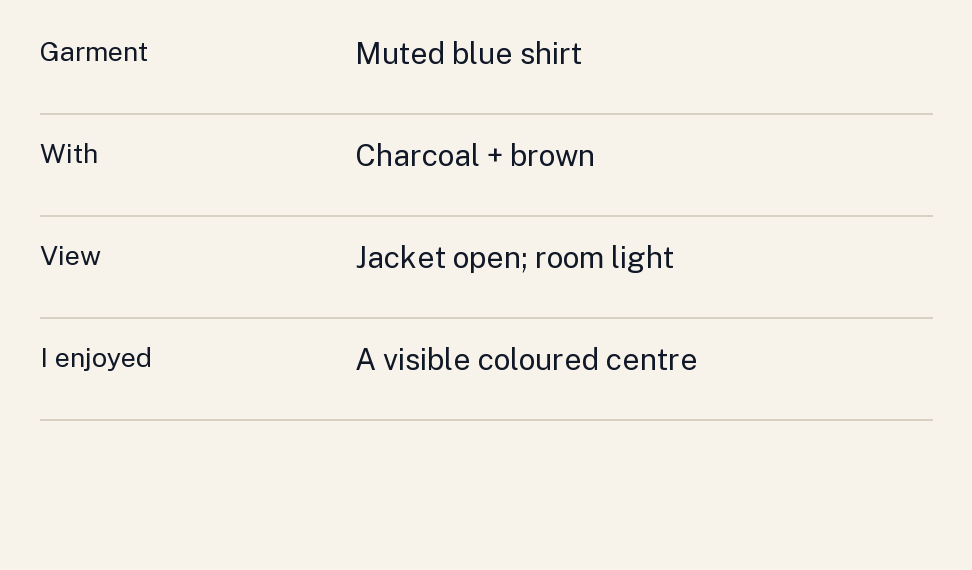
Save a short note with the preferred outfit: muted blue shirt, charcoal trousers, brown jacket open, viewed near the window and under the office lights. Add what you enjoyed, such as a clearly visible centre or a close transition between layers. The next time you dress, you have a reproducible combination and a precise starting point for another experiment.
Follow an observation through to a decision
Imagine you have medium-depth skin, dark hair and a short dark beard, and want another shirt for a navy jacket. Those features describe the person in this example; they do not prescribe a palette. You try a vivid blue and a muted blue. You prefer the muted version because you enjoy the quieter coloured centre. Record that observation without claiming that every person with those features needs muted blue.
Next compare a pale muted blue with a deeper muted blue. You might prefer the pale one with the jacket open and the deeper one when wearing the shirt on its own. That gives you two arrangements with different purposes. If the shirts also differ in collar shape, include that in the note. A preference for the complete outfit remains useful even when the comparison cannot isolate every cause.
Now imagine the same process with light skin and grey hair, or deep skin and closely cropped hair. Begin again with the person's preferred effect and actual clothes. The sequence remains available, while the result can differ. Another person may enjoy a vivid colour as the main feature. Keep that person's stated preference in the record, alongside the actual garments used in the comparison. What travels between readers is the method: name an aim, compare a manageable difference and retain the conditions of the preferred version.
Sources
- CIE, perceived colour, e-ILV 17-22-040. Technical vocabulary and dependence on viewing conditions; no personal palette system is established by this definition.
- J. Wendy Brown and Andrea Rojas, Determining Personal Colors, New Mexico State University, C-315. Consumer guidance used for considering skin, hair and eyes and comparing garments near the face. Fixed complexion exclusions and appearance hierarchies are not adopted here.
The combinations, comparison sequence and note format are original styling suggestions. Screen swatches illustrate relationships and cannot identify a person's complexion or an exact fabric colour.